
An data visualization tool that sheds light on the staggering environmental footprint left by fast fashion's unsustainable practices through data-driven insights with specific emphasis on plastic-based textiles.
Role:
Developer
Team:
Individual
Languages:
HTML/CSS Modules/JavaScript
Tools:
D3.js, React Framework, Kaggle
Overview
Problem Space
Consumers often lack clear, data-driven insights into the environmental impact of fashion fashion choices. On the other hand, Fashion companies are unaware just how their productions of fabrics bring severe damage to the ecosystem.
Solution
I created The Threadprint a data-driven visualization tool designed to address this gap by providing an accessible platform that visualizes staggering metrics of different fabrics within companies.
So why the Challenge?
How it begins…
Earth's 2nd polluter
According to Earth.org the Fashion Industry is the second largest polluter globally after the oil & gas industry. This is due to its significant use of water, production of carbon emissions, & textile waste. Read more here.
Industry Challenge
Technical Challenge
I also wanted to do more personal projects that aligned with my passions & really challenge myself in my abilities. So I pretended that this was a hackathon & provided myself 2 weeks to develop this project.
Design Process
Sourcing Data
The journey began with in-depth research into the fast fashion industry. I sourced a public dataset from Kaggle that focused on industry metrics such as sales revenue, textile types, and environmental impacts like CO2 emissions, water usage, and waste generation. It also provided environmental reports, industry publications.
The Main Goal
The challenge was to structure this complex dataset for meaningful visualization.
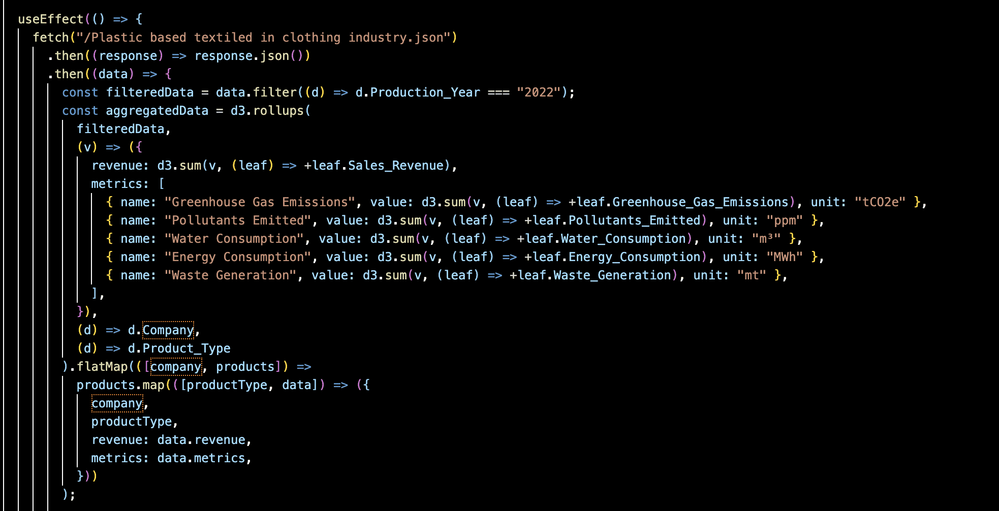
Therefore I believed that a hierarchical JSON structure would best capture the relationships between companies, textile types, and environmental metrics, forming the foundation for an engaging and interactive experience

How It Works
- Data Sourcing: Utilized a publicly available environmental impact dataset to extract statistics for different fabrics and clothing companies.
- Intuitive Visualizations: Created clear, interactive visuals to help users compare the environmental impact of different materials and make more sustainable fashion choices.
Key Considerations
- Accuracy & Transparency: Ensuring that data sources were reputable and the methodology for calculations was clear.
- User Accessibility: Designing an interface that was easy to navigate for both sustainability experts and general consumers.
- Scalability: Developing a flexible framework that could integrate additional sustainability metrics in the future.
Drawing the Visuals
Packed Bubble Chart: Each bubble represented a textile type, sized by sales revenue and color-coded to reflect environmental impact. Users could filter by company to see trends.
Dynamic Updates: A responsive interface allowed users to filter data by selecting specific metrics or by production year, updating the chart to show relevant information.
Tree Map: Each color-coded tile represented a textile type, sized by different environmental impacts. Users could compare material usage across brands, with interactive tooltips providing detailed impact metrics on hover.
Bar Chart: Each color bar represents a product type, with height encoding Revenue from Sales and color differentiating key metrics like emissions and water usage. Interactive filters & tooltips allowed users to compare sustainability trends, revealing the stark contrast between materials and companies.
Enhanced Interactivity
Highlighting & Linking: When users selected a company, its data stayed prominent while others greyed allowing for simple comparative analysis.
Interactive Tooltips: On hover, tooltips revealed robust details such as textile types & environmental impacts, offering an informative snapshot of data
Filters & Buttons: Users can change between different metrics such as Sales Revenue, Green House Emissions, etc. in which the graph would present the updated data
Environmental Legend: A contextual legend provided clarity, dynamically updating to reflect metrics like CO2 emissions, water usage, & waste as users navigated the chart.
Challenges I overcame & will overcome
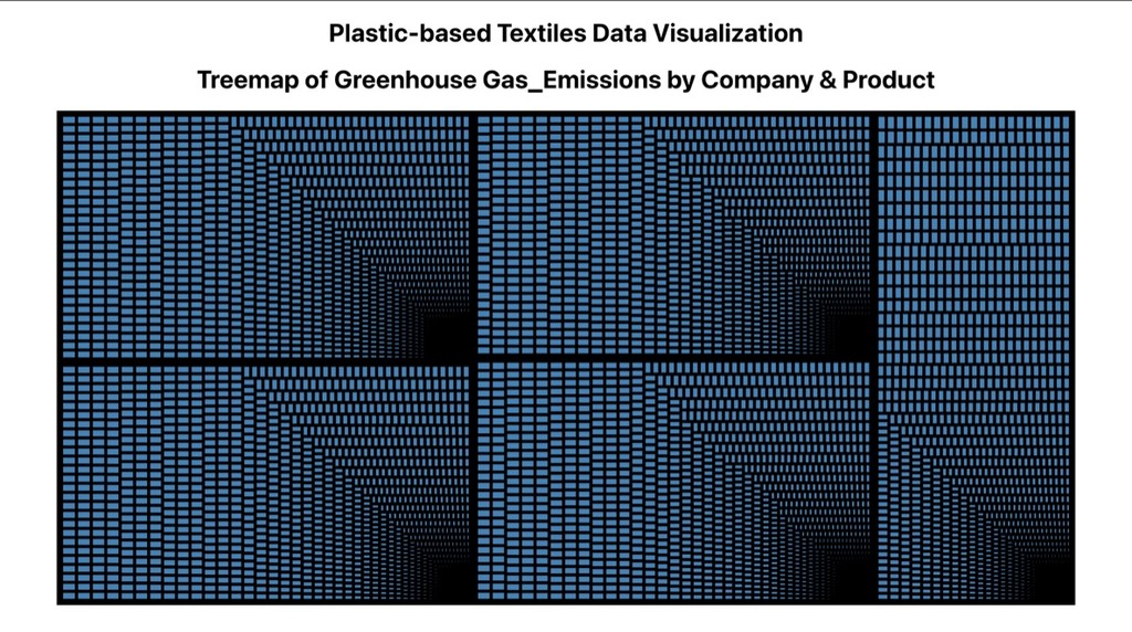
State Management:
- useState(), useCallback()
- Learned how to properly keep track of & update data so that it could reflect on the graphs
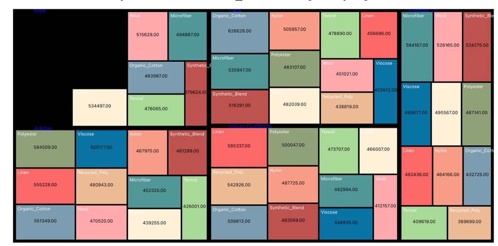
Converting a flat JSON format into hierarchical format:
- Incorrect parsing of the dataset caused missing data or granularity
- Learned how to adjust hierarchy of the data structure & also aggregating data
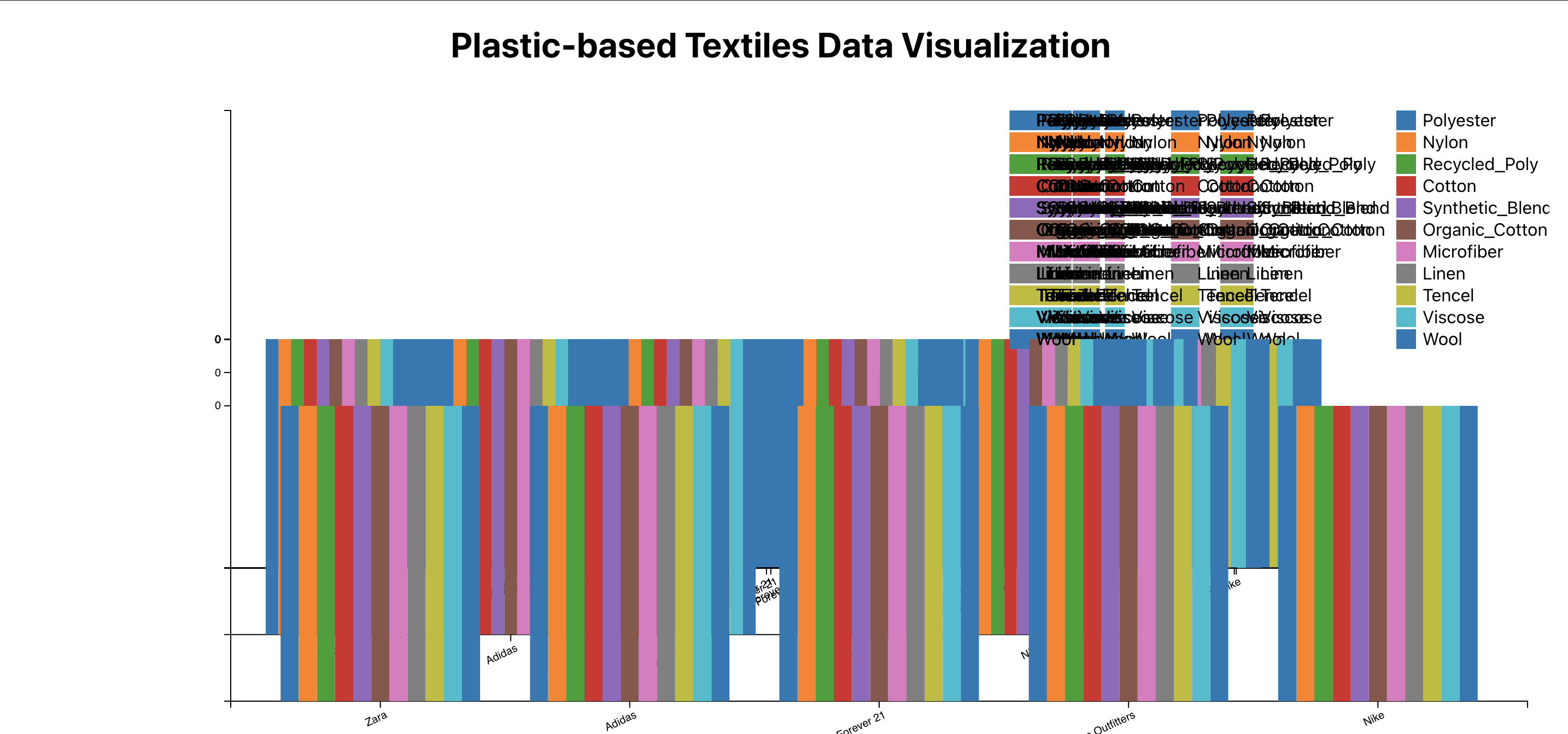
Infinite loops of Rendering useRef():
- Dealt with ‘Maximum update depth exceeded’ errors which caused infinite re-rendering of a page bc of improper dependencies & use Effect hook updating the state correctly
What I Learned
01
This project was a 2-week sprint!
In an effort to practice my skills, show commitment & learn more about environmental impacts, I tackled a complex project within a tight deadline, making strategic decisions on what features to implement first while keeping the scope realistic.
02
Problem-Solving
Given the timeframe I learned & practiced how to quickly overcome challenges, troubleshoot issues, and adapt on the fly.
03
Visualizing data with D3.js
Despite D3.js being a STEEP learning curve (fixing errors was a total nightmare), I’m still glad I was able to put this project together as a testimony to rapid execution, determination, & working under pressure. Plus I learned a new library that I can continue to use as a tool!
04
Data StoryTelling
Numbers alone don’t drive action. How you present the information matters. Sometimes all it takes it a pie chart to make the impact of fast fashion unignorable.
Check out my code on GitHub!